
I ended up getting really busy towards the end of November and have subsequently fallen behind on my blog entries. I do plan to stay on top of them in future, aiming to get each entry published on the same day as the classes. Here are updates for progress made in the past two weeks for all my lessons.
Engines:
We are continuing to develop our platformer game in UDK and have included the use of; the LightMassImportanceVolume, for illumination; ReverbVolume (or ‘Ambient Zones’), to deal with localised sounds; creating traps and moveable platforms, by converting a static mesh and animating them using the Matinee function through Kismet.
I found the ReverbVolume made sense and there wasn’t really much I wanted to do with them other than get them in place and test them out, but I’m pretty confident that I could use them well in the future. Creating a crushing trap was also simple, but I wanted to work on getting the fan blade to rotate too, which Tobe explained how to do but we ran out of time before I could implement the solution we discussed.
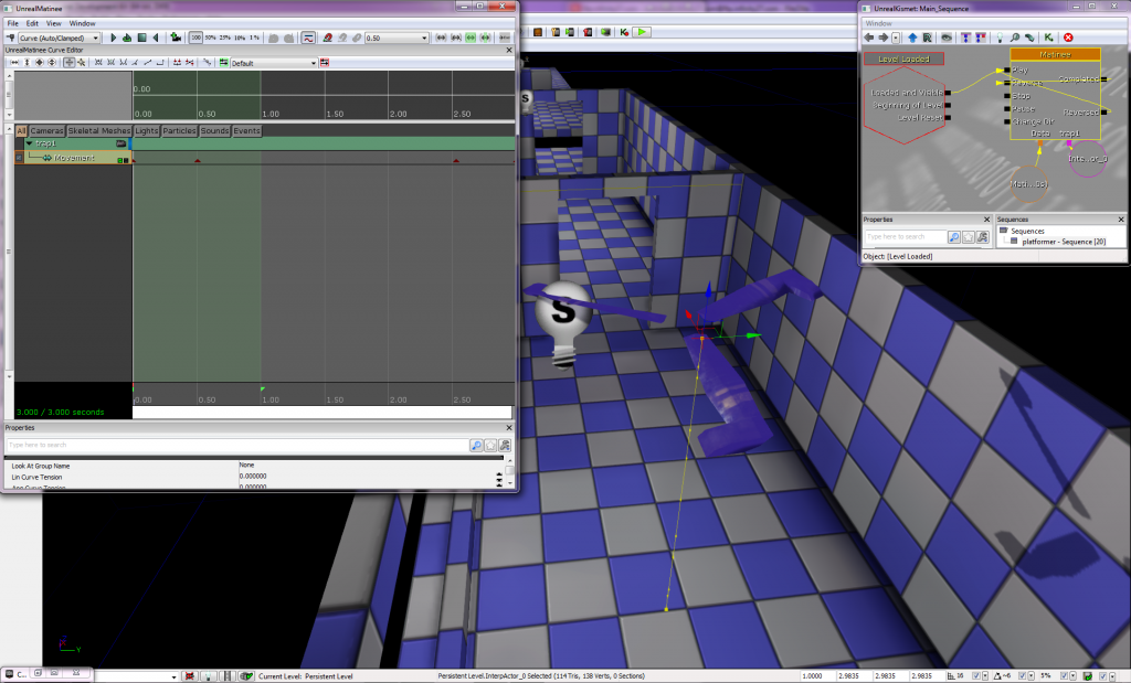
With this new knowledge, I should be able to construct a demonstration level, using the built-in assets. I plan to get this done over the break from university we have in December, so I can spend a solid amount of time on it in one go, which I find works best for me. When I finish it I will upload a video of me playing through the level, along with commentary on how I used my skills to achieve this. That will also give me an opportunity to get up to speed on video and audio editing, which I would like to know more about.
Tobe also addressed my earlier concern about scripting in UDK and stated that we will not be looking at learning this aspect of the engine, in light of the move to C++ in Unreal Engine 4, which was a concern I’d voiced previously. Phew!
Digital Art:
Martin tasked us with creating a turret from our own research/imagination, which we would use in our animation class. Since we would be animating the model, he asked us to make sure we include moving parts into its design.
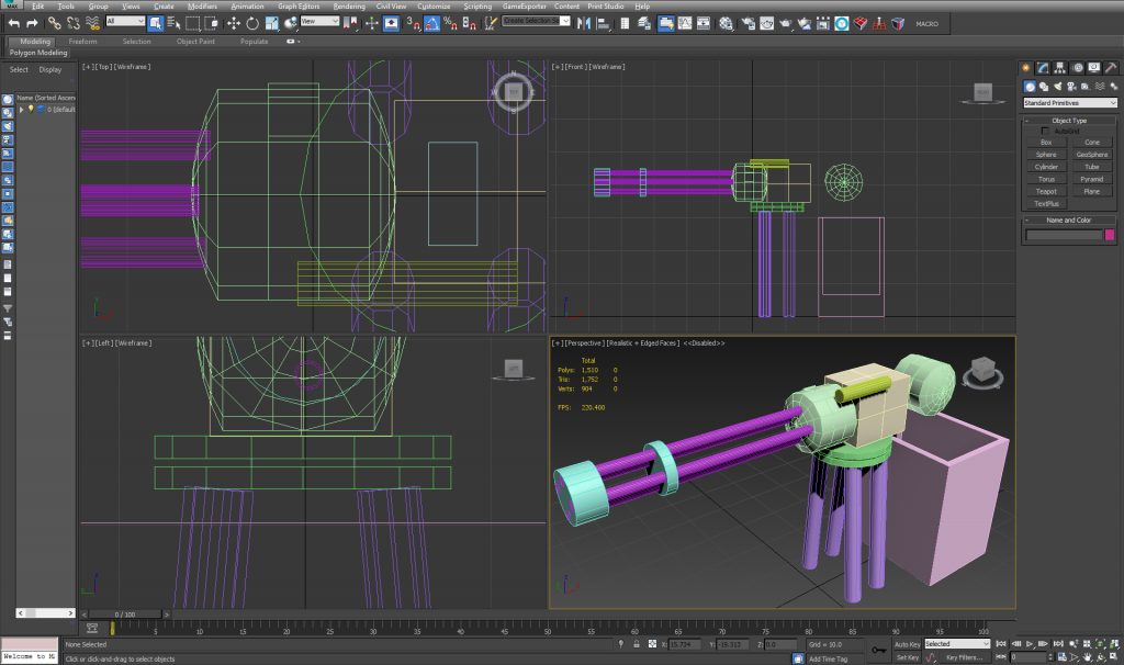
Every time we use 3ds Max I find myself getting confused over the user interface. Though this task went a lot smoother than earlier ones, I still feel I am missing some critical knowledge on how to manipulate the objects; such as, splitting and deforming individual polygons; or ‘baking’ the objects into a whole. These are things I feel I know how to do in Maya but seem unintuitive or hidden in 3ds Max.
I had followed some tutorials online previously but I feel I may have missed some important ones out, so I’m going to go back over these and practice making simple objects until I am happy with the level of detail I can achieve.
We have now begun working on another unit with Martin, which is titled ‘2D Digital Graphics for Computer Games’. In the lesson, we discussed and then done some research on the use of visual styles in video games.
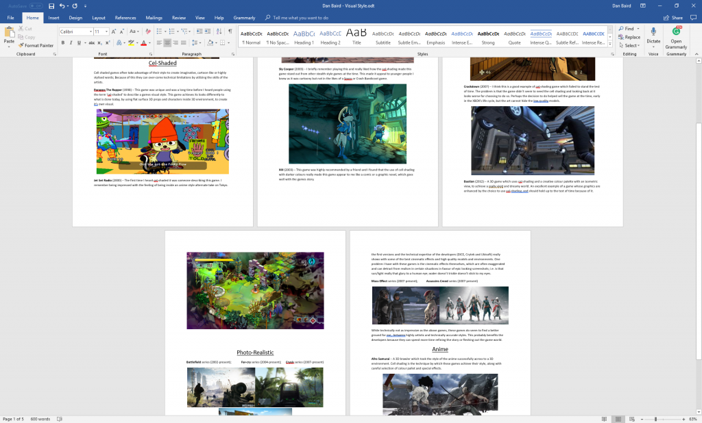
The three styles we looked at in class were photorealistic, cel-shaded and anime. we still have to present to the class, but here is a little of what I wrote.
On photorealism in Battlefield, Crysis and Far Cry:
F.P.S. games have always been in a technological arms race when it comes to graphics, which I guess is a good thing when your crossing the uncanny valley. All of these have been really good looking games since the first versions and the technical expertise of the developers (DICE, Crytek and Ubisoft) really shows, with some of the best cinematic effects, the highest quality models and the most detailed environments. One problem I have with these games is the cinematic effects themselves, which are often exaggerated and can detract from realism in certain situations in favour of epic looking screenshots; i.e. is that sun/light really that glary to a human eye; water doesn’t trickle or stick to my eyes like it does a camera; is that motion blur or is my character crying uncontrollably?
I’ll present this to the class next week and then I can use the feedback I get to update my opinions and put the presentation up here in its entirety when I’m finished.
Animation:
We spent some time revisiting and refining our walking animation which we first made earlier in the month.
I am convinced that the revised animation is superior and am happy that we got to revisit this, as I felt I had gotten it well the first time but it’s always good to go back and rework things to get better at them.
We also got to animate our turret, after importing it into Maya from 3ds Max. I can’t provide a sample as I must have saved the file to a temporary location on the college network. More fool me!
Contextual Studies:
I am having lots of fun in Lucy’s lessons, where we have continued to look at semiotics and representation in games.
In class, we discussed how different parts of life are represented in games, such as; war, communism, consumerism, capitalism, sexuality, gender, race and ethnic groups, among others. This led to two short tasks, which had us create presentations on two subjects of our choice.
My first choice in class was to write about capitalism. Lucy explained she’d like us to examine three games and how our chosen topic is represented in each. I did a little research online and created a slideshow and commentary on three games; Greed Corp, The Sims (series) and Capitalism II.
I had positive feedback from the tutor at the end of the class but I do want to spend some more time getting my notes into order before I put this up for you to read.
Lucy had also asked us to go in depth on a specific video game character, using what we had learnt from analysing movie posters. I chose the Big Daddy, from one of my favourite games, Bioshock.
Given the combination of the underwater setting, their distinctly deep sound and dominant stature, it’s possible for me to imagine that the Big Daddy is the figurative ‘whale’ of the Rapture ecosystem. Whales have few natural predators, which is also true of the Big Daddy, and they can be described as serene creatures, which is how I would describe the Big Daddy when one is alone and unchallenged. I can’t draw a lot of parallels but I do find this idea still comes to mind again when characters call the protagonist “little fish” and the Big Daddy “Mr. Bubbles”.
– from my Semiotics of the Big Daddy article.
I really enjoyed doing this and I put a lot of hours into getting the wording and structure of the document correct. This has been a good exercise for me to practice my English writing skills, as I felt I had been having problems in class with explaining my opinions with enough clarity and writing in a structured and sensical manner.
Life Art:
We continue to look at drawing techniques and practising drawing from a live model. It’s been a great experience and I have been really trying to improve my work based on Dave’s feedback and my own critical analysis.
At the start of the last lesson I was told to find a picture, of anything, and to work the picture creatively into my drawing, to make something Dave described as “half human half whatever”. So this piece was a combination of the live model and a picture of a bonsai tree. I aimed to make the tree appear as if it was like growth from the body, coming out of the collar of the model.

The task was difficult as I had no reference of scale against the model, nor any real feel for the physicality of the plant itself. For example, I decided to scale the tree to fit around the forehead of the model, which to me seemed to throw off the proportions of the model. I would change if I was to re-do this piece, but perhaps it is just a product of translating the object from a photograph.
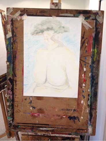
Dave pointed out that the face became too rigid and two dimensional from the bold strokes I had used, which I agreed with. He suggested to instead apply lighter, more suggestive lines instead of drawing the full features of the face and this worked out brilliantly. I will certainly try to avoid getting into too much detail, especially because I do prefer that minimalist style myself.
We where told there were pastels available so we could add some colour to the scene if we liked but to avoid getting overzealous with them. I did go for the pastels as you can see, but since I am not familiar with them I quickly made the mistake of applying them too heavily. I did manage to effectively disperse the colour by smudging the pastel enough to give it a more washed out look. Hopefully, I will get another chance to develop some skill in this area, perhaps I may buy some pastels to practice with after the new year.